
A concert tour by Troy Lucas Music across Vancouver Island, celebrating community and culture through big band jazz.
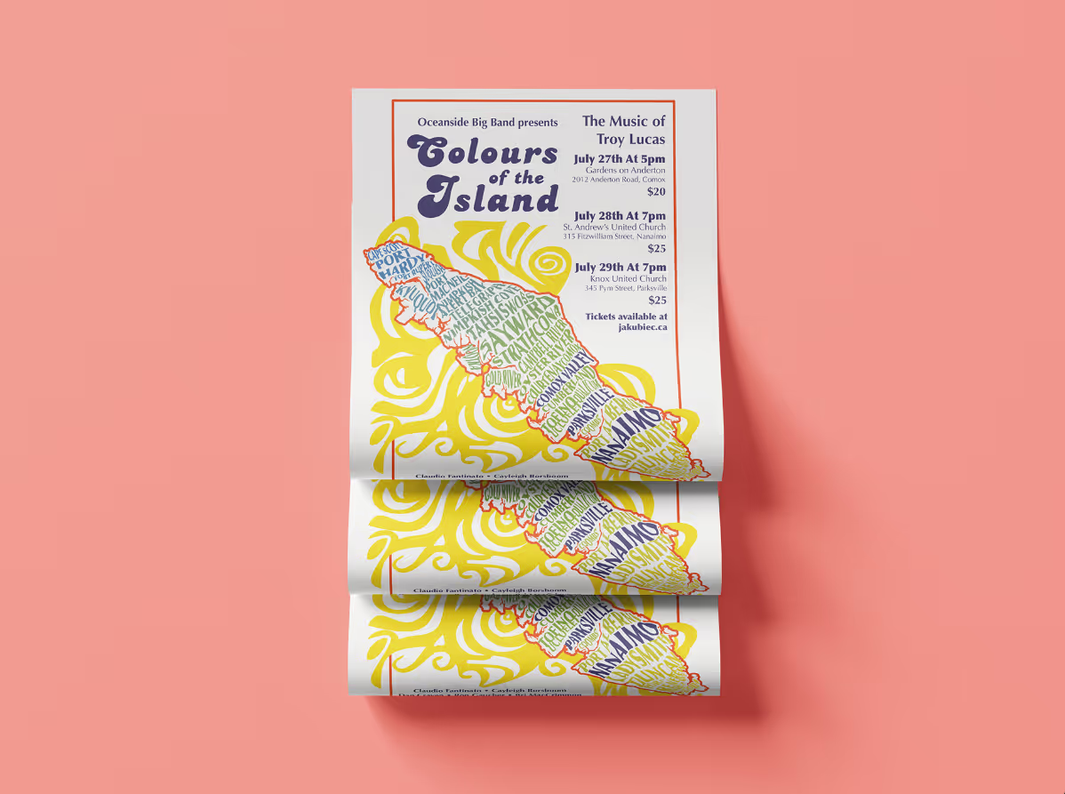
Designed bold, eye-catching posters distributed across Vancouver Island and a clean, accessible event program for attendees.

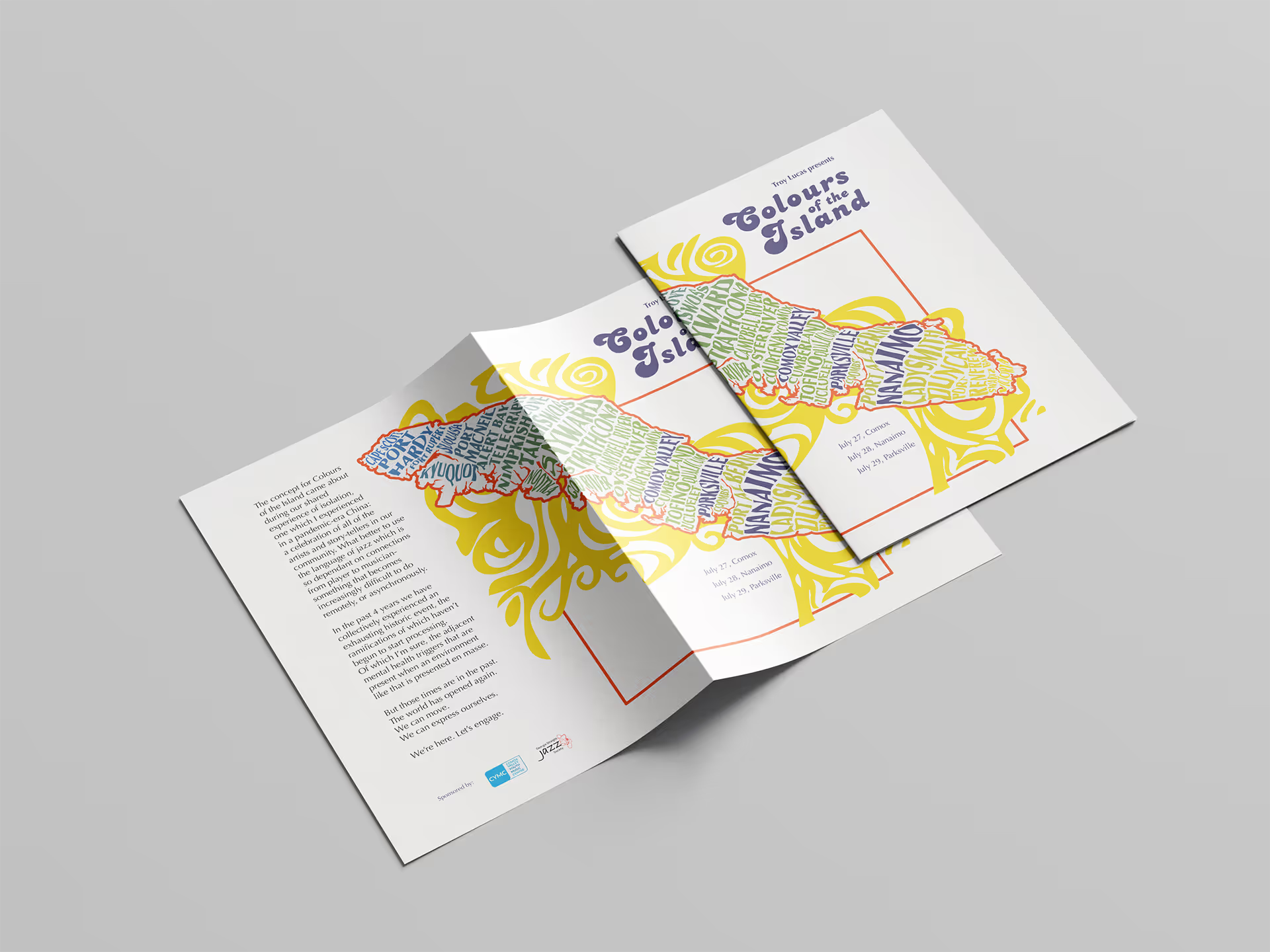

Designed in InDesign, with clear hierarchy and accessible type for audiences.
Secured placements in local newspapers and community bulletins, ensuring regional coverage and word-of-mouth reach.
Filmed and edited promotional concert footage to share across platforms, continuing the campaign and extending audience engagement beyond the live events.

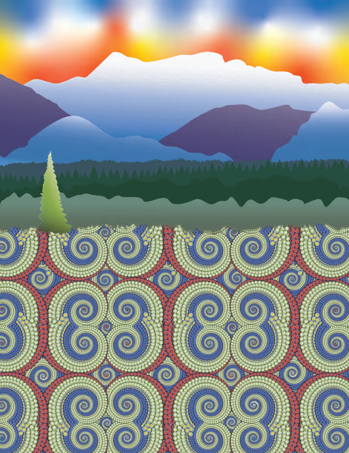
Fractal & Pattern Requests:
The project began with Troy’s idea to incorporate fractals into the poster. I experimented with bold, repeating patterns that reflected rhythm and movement in jazz music.
Colour Experiments:
Early iterations explored gradient-heavy palettes inspired by sunsets, water reflections, and abstract patterning. The focus here was on the Comox Glacier, hoping to connect the imagery to local landmarks.
Trombone Shorty Poster:
I drew inspiration from a framed New Orleans Jazz Festival poster in Troy’s collection. Its saturated palette and lively typography influenced my early colour direction and type hierarchy.
Cultural References:
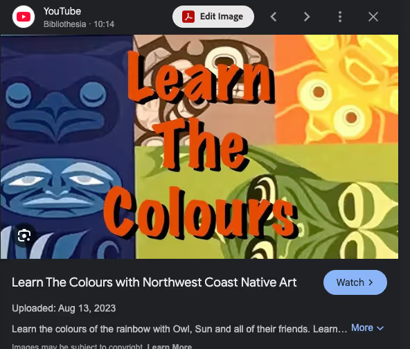
While experimenting, I researched Coast Salish art and the pigments traditionally used on the Northwest Coast. This led me toward a palette rooted in local cultural context rather than purely abstract colour.
Island as Canvas:
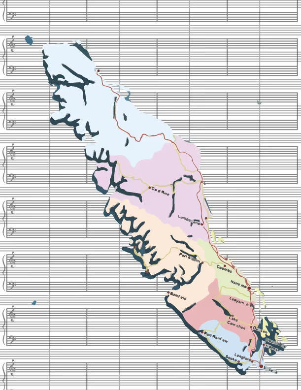
I shifted from abstract fractals to using Vancouver Island itself as the focal motif. This grounded the design in place, making the campaign directly recognizable to the community.
Typography Trials:
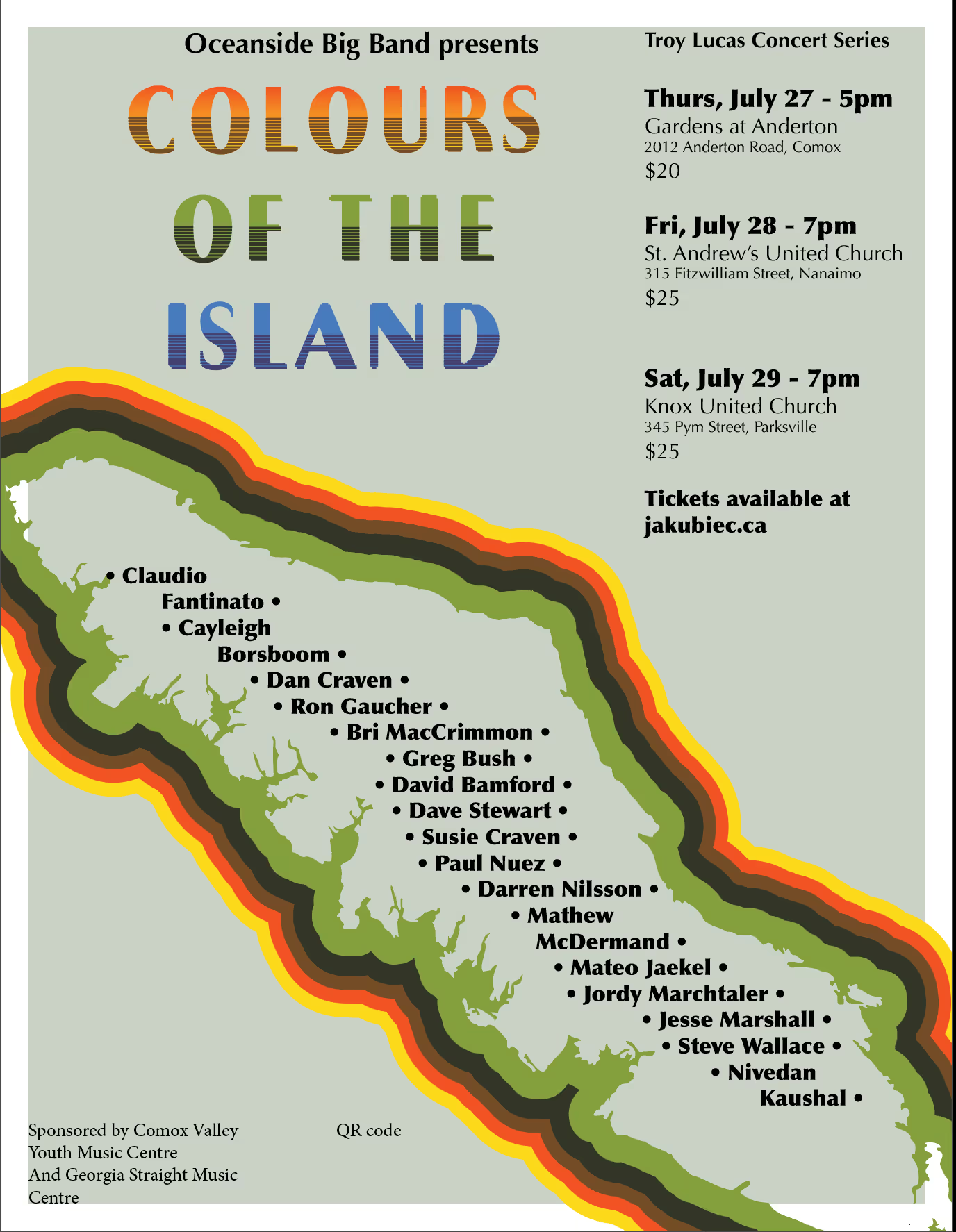
Multiple versions of the title treatment were tested. The goal was to find a balance between playful, bold type and legibility for print at various sizes.
Poster Refinement:
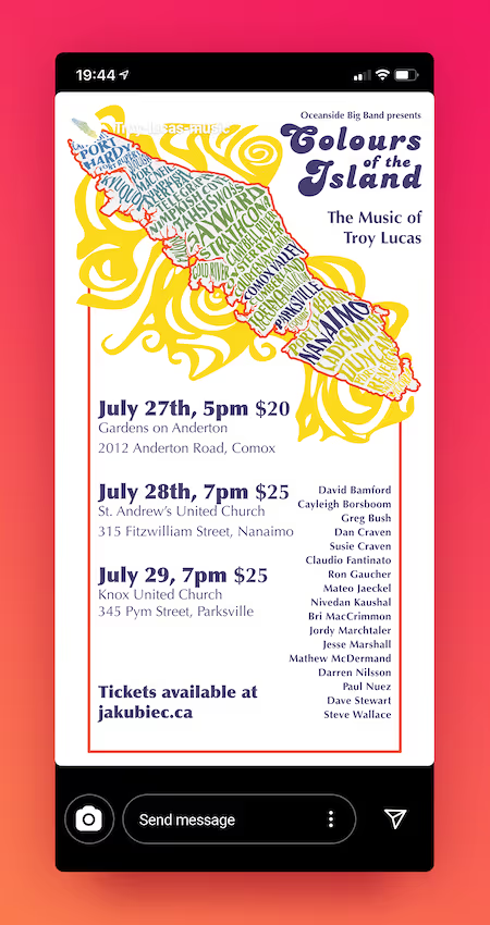
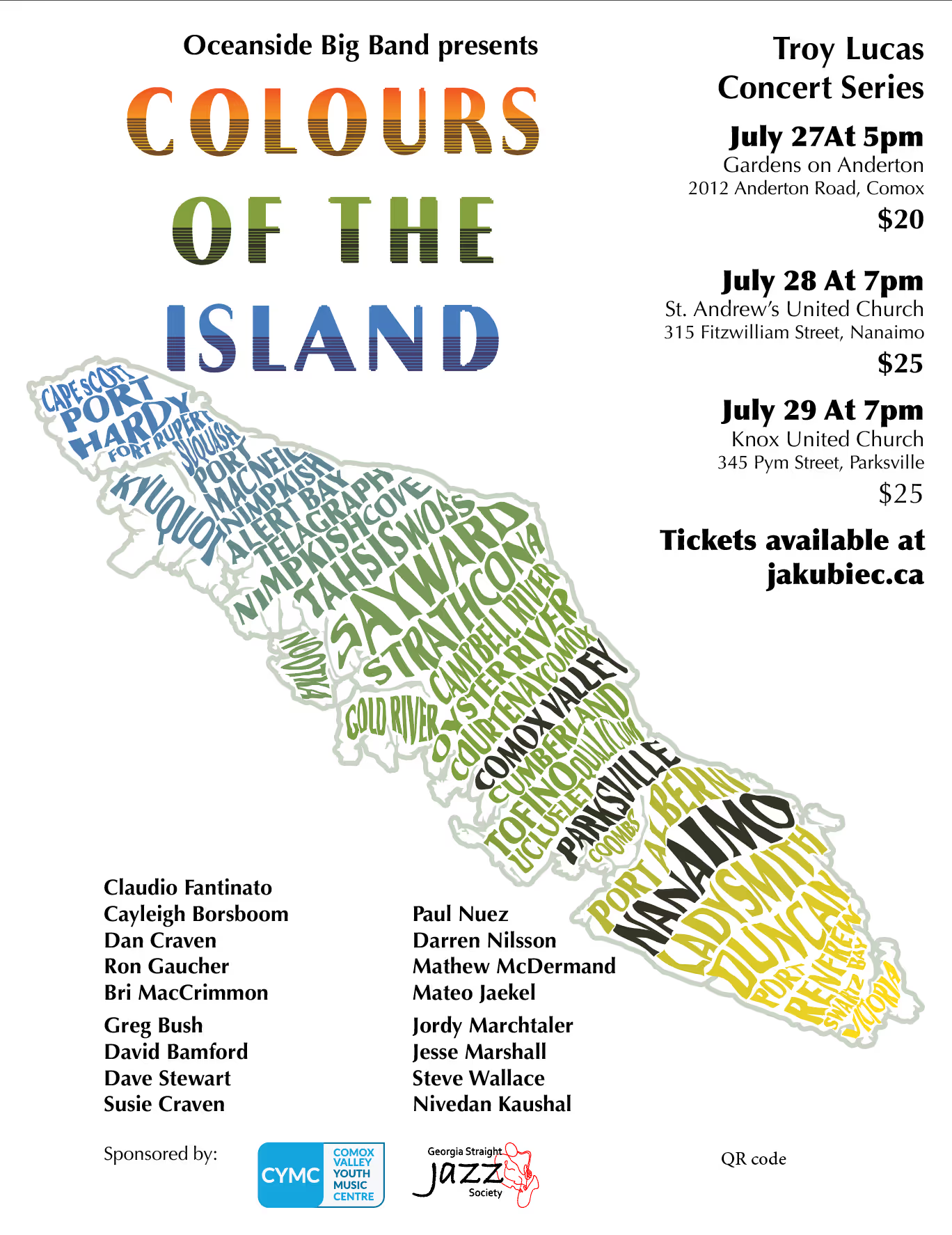
The final poster paired the Island silhouette with swirling Coast Salish–inspired colours, tying together music, land, and community.
Marketing Collateral:
Once the poster identity was finalized, I adapted it across event programs, social media graphics, newspaper ads, and Eventbrite. This ensured the look and feel was consistent across all channels.



![[background image] image of educational brochures (for a university)](https://cdn.prod.website-files.com/6863109531025c9e446aa76b/68bd99c884a4f1453c7d7b1a_Colours-of-the-Island_A4-Rolled3_Screenshot.avif)
Colours of the Island was a three-concert tour featuring the Oceanside Big Band. I designed and managed the full campaign, from poster design to social media and event logistics.
Colours of the Island became more than just posters and programs, it turned into a recognizable identity that tied together three towns, local musicians, and their audiences. The print materials circulated in cafés, community halls, and music venues across Vancouver Island, while the coordinated social media and newspaper features reached people who might not have otherwise discovered the concerts. By rooting the visual system in the island itself, the campaign helped foster a stronger sense of community pride around the performances.
Balancing client requests with cultural context taught me how to push an idea further, from abstract fractals to a design language that felt both local and meaningful.
The final campaign successfully promoted a three-concert tour in Comox, Nanaimo, and Parksville. Ticket sales and attendance exceeded expectations, with the concerts drawing diverse audiences from across the region. More importantly, the work reinforced for me the value of iteration, research, and refinement: principles I now bring to every design challenge, from cultural campaigns to brand systems.
I strengthened my ability to adapt a single identity across mediums, ensuring posters, programs, social media, and video content all felt cohesive and consistent.
