Honeybee: Decision Building

Capstone Project
Bachelor of Design in Graphic Design, Vancouver Island University

Deliverables

Visual Identity

  • Logo: Developed from hand sketches into a single-line bee illustration combined with hexagon motifs.
  • Moodboards: Bohemian textures, honeycomb grids, scrapbook journaling, line-art florals.
  • Typography: Palmer Lake (headers/logotype) and Avenir (body).
  • Colour Palette: Grounding blues/greens paired with honey yellows, muted browns, and warm coral accents. Greyscale checks ensured accessibility for colour-blind users.
Click here to enlarge images

Pamphlet / Brochure

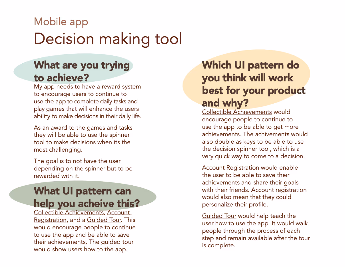
Short, client-facing explainer for designers/marketers on how colour, hierarchy, and accessibility reduce decision friction. Distributed with calls-to-action toward the digital prototype.

Poster Campaign

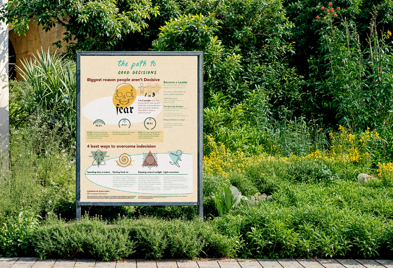
A set of awareness posters that normalize indecision and preview Honeybee’s calming actions. Designed for cafés, community boards, and campus spaces; optimized for readability and quick scanning.

Colour Psychology Card Deck

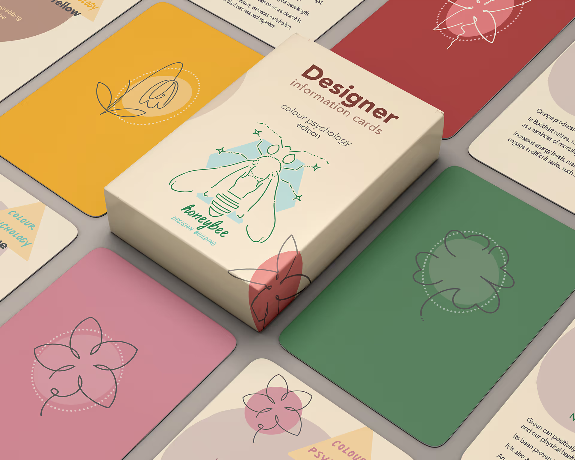
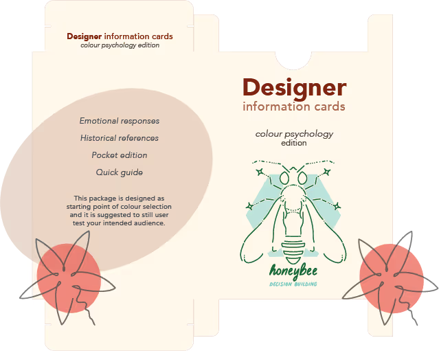
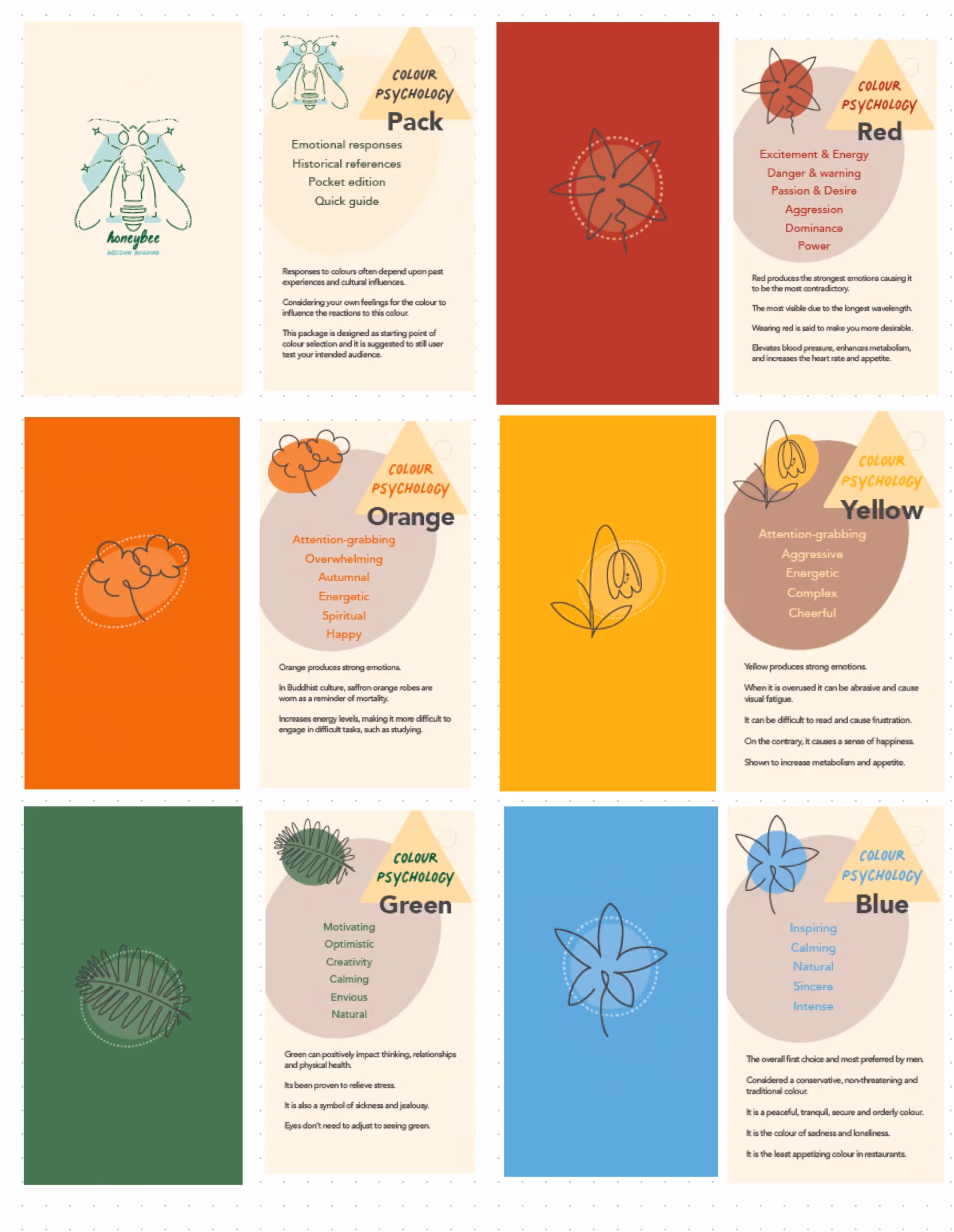
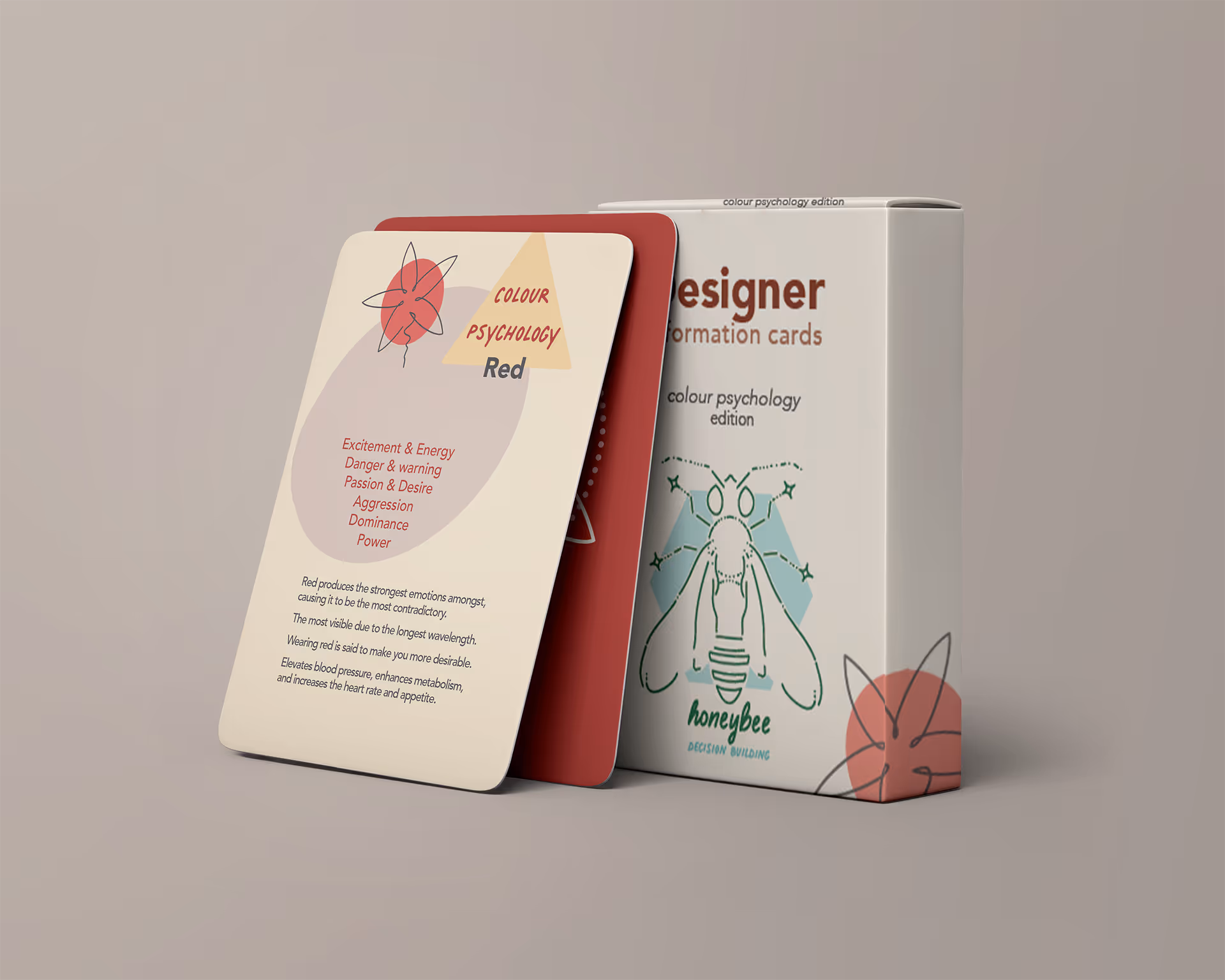
The Honeybee Colour Psychology Deck was designed as a bridge between research and practice.

  • Format: Tarot-sized (2.75" × 4.75"), easy to handle and reference.
  • Content: Each card combines a floral line illustration, colour swatch, and short notes on psychological and cultural meaning.
  • Accessibility: Designed with colour-blind checks in mind, encouraging awareness of how palettes are perceived differently.
  • Purpose: A playful yet academic tool to remind designers that colours gain meaning in context, not isolation.

Fidget Ring & Packaging

  • Ring: A spinner engraved with yes/no symbols, creating a small ritual that reduces hesitation and decision stress.
  • Packaging: Hexagonal fold-out box referencing honeycomb geometry; doubles as a tactile fidget surface.
  • Role: Extends Honeybee’s theme of multi-sensory design tools, balancing digital app features with tangible aids.

Mobile Application

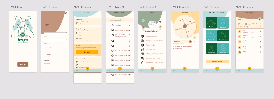
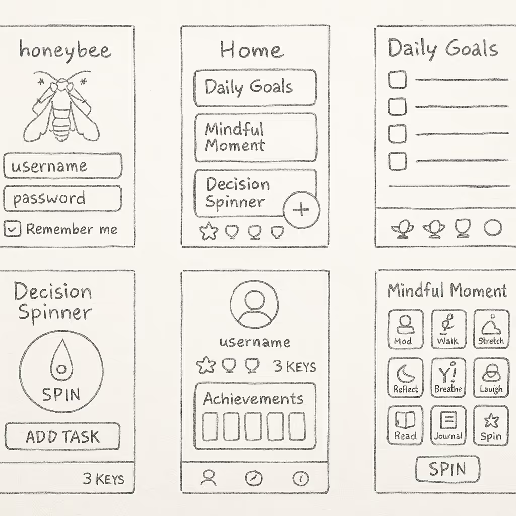
The core digital extension of Honeybee.

  • Sketches: Early pencil explorations of navigation and flow (later recreated digitally with ChatGPT assistance as original scans were lost).
  • Wireframes: Low-fi hand-style sketches were converted to grayscale digital wireframes for clarity (This was also done with ChatGPT assistance).
  • Hi-Fi Wireframes: Created in Adobe XD, the mobile App had many pages, listed below.
  • Hi-Fi Mockups: Scrapbook aesthetic — textured paper, taped notes, doodles, and polaroid-style framing, keeping the UI warm and approachable. These Mockups were created using ChatGPT to bring the wireframes into a relatable scenario.

Screens Designed:

  • Splash & Login
  • Home Dashboard (daily goals, challenges, spinner, awards)
  • Daily Goals Checklist
  • Profile (avatar, badges, keys)
  • Decision Spinner (central wheel with spin button + input field)
  • Mindful Moments (grid of calming activities)
  • Challenges (weekly calendar view)
  • Awards & Progress Tracking
Click here to enlarge

Process

Research & Concept Development

Methods: Literature review, colour psychology, anonymous Google Forms survey (45 responses).
Key Insights:

  • Fear of failure and lack of information were top barriers to decisions.
  • Colour is perceived in context (Josef Albers, Interaction of Colour).
  • Human spectral sensitivity peaks (yellow-green in daylight; blue-green at night) guided palette choices.
  • Honeybee spectral vision (yellow, blue, UV) inspired the brand metaphor.

Personas & User Journey

  • Persona: “Emma,” a 23-year-old student, struggles with daily indecision amplified by anxiety and digital overload. Needs a tool that feels friendly, not clinical.
  • User Journey:
  • Trigger: Overwhelmed by choices (e.g., assignments, meals).
  • Action: Opens Honeybee app, reviews goals, spins decision tool.
  • Resolution: Feels calmer, re-centred, and ready to act.
  • Takeaway: Personas and journey mapping kept the project human-centred, ensuring features addressed real frustrations instead of staying abstract.

UI Patterns & Design Principles

  • Patterns Chosen: Collectible Achievements, Account Registration, Guided Tour.
  • Why:
  • Achievements motivate ongoing use and unlock the spinner tool.
  • Registration personalizes progress and fosters accountability.
  • Guided Tour helps users learn app features without overwhelm.
  • Design Principles: Quaint, Friendly, Educational, and Wellness-driven — grounding the app in positivity and routine.

Project Overview

Many people struggle with indecision, often caused by fear of failure, lack of information, oroverlapping challenges such as anxiety and colour-vision differences.

Deliverables:
  • Visual Identity (logo, palette, typography)
  • Pamphlet / brochure
  • Poster campaign
  • Colour psychology card deck & Packaging
  • Fidget ring & packaging
  • Mobile app (low-fi sketches, grayscale wireframes, scrapbook-style hi-fi mockups)

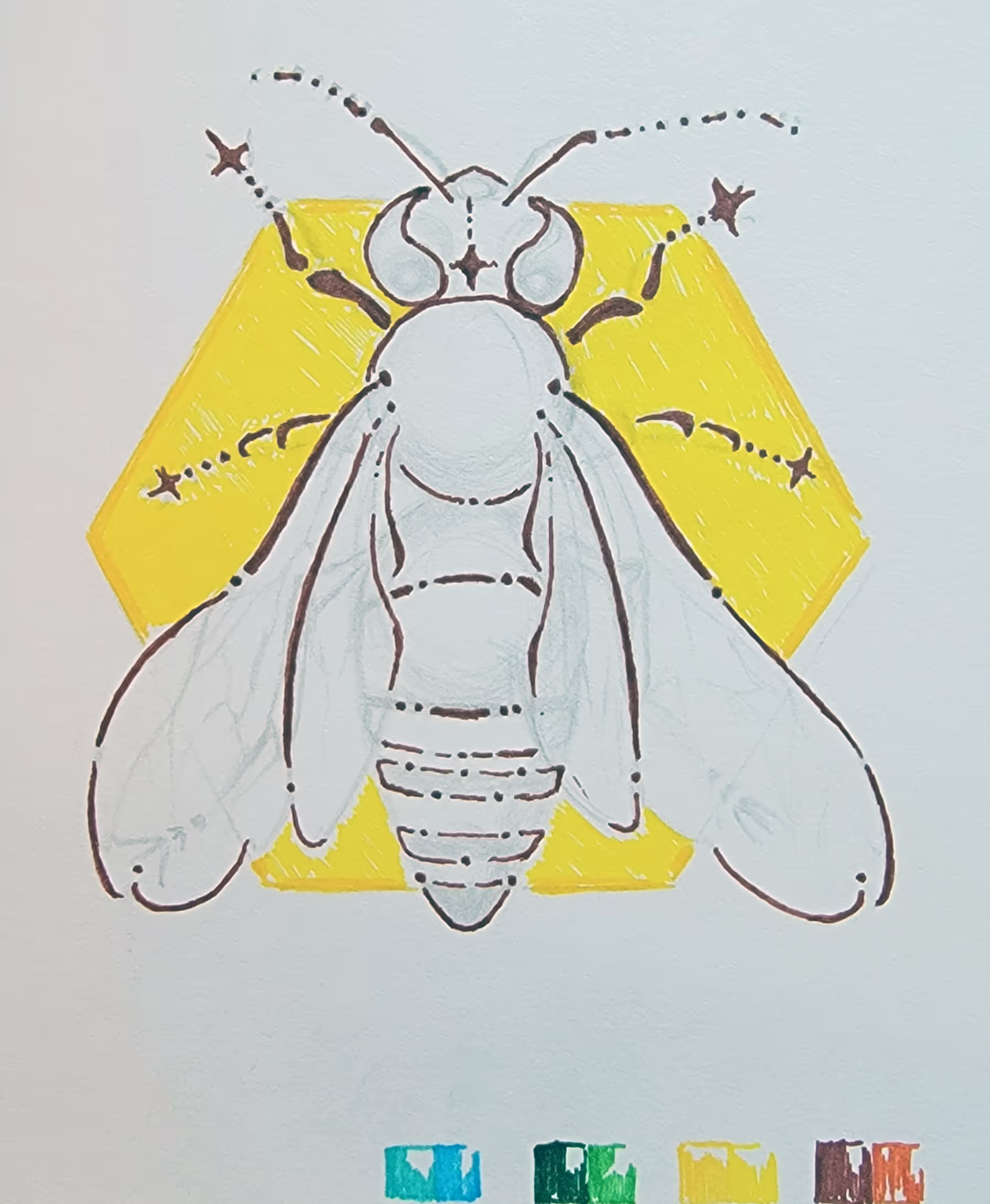
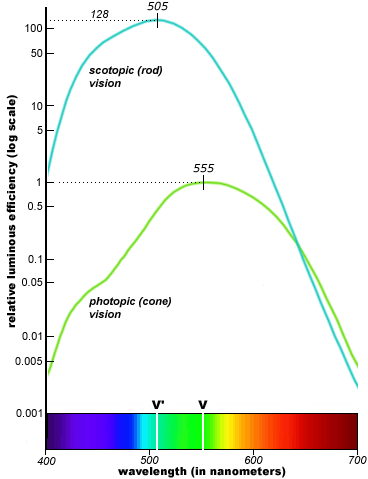
Key inspiration: Honeybee vision. Unlike humans, honeybees perceive yellow, blue, andultraviolet light, enabling them to quickly identify flowers with pollen. This became thefoundation of the design strategy: leveraging colour psychology and accessibility principles tocreate tools that help people “land” on decisions with more confidence.

Industry:

UI/UX
Wellness
Inclusive Design
Product Concept
Product Design
Packaging Design
Graphic Design

Timeline:

Sept 2021 – Apr 2022
(8 months)

My Roles:

Research
Branding
Visual Design
Prototyping

Tools:

Illustrator
InDesign
XD
Goodnotes
Google Forms
ChatGPT

Reflection & Outcome

Project Outcomes

  • A cohesive identity across print, product, and digital platforms.
  • Tangible prototypes that embodied abstract research findings.
  • Research synthesized into tools people could actually hold, use, and imagine in daily life.
  • A scrapbook-style app mockup that visually communicated warmth, accessibility, and inclusivity.

Community Impact

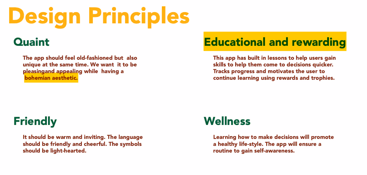
Honeybee reframed indecision as a shared experience instead of a personal flaw. By combining tactile (cards, ring, packaging) and digital (app) deliverables, the project made decision-making feel approachable, supportive, and even playful. Materials were designed to be low-cost and adaptable for students, classrooms, and everyday routines.

What I’d Do Next

  • Run usability testing on the app’s spinner and goal-setting features to validate effectiveness.
  • Expand the card deck into a full “design principles” series (e.g., typography, accessibility, hierarchy).
  • Explore the possibility of prototyping a lightweight MVP app to test in real-world scenarios.
  • Share research findings with peers to spark discussion about the role of colour and multi-sensory design in decision-making.

Design Growth

This project was a turning point:

  • I learned how to translate academic research into tangible outputs, balancing rigour with creativity.
  • Developed confidence in inclusive colour use, contrast testing, and cultural considerations.
  • Grew my ability to design consistently across mediums — branding, packaging, publication, and UI.
  • Realized the importance of personas and journey mapping in grounding abstract ideas in human needs.